CSS Learning Notes
Cascading Style Sheets (CSS) is a stylesheet language, standardized across Web browsers according to W3C specifications, used to describe the presentation of a document written in HTML or XML on screen, on paper, in speech, or on other media.
1. Basics
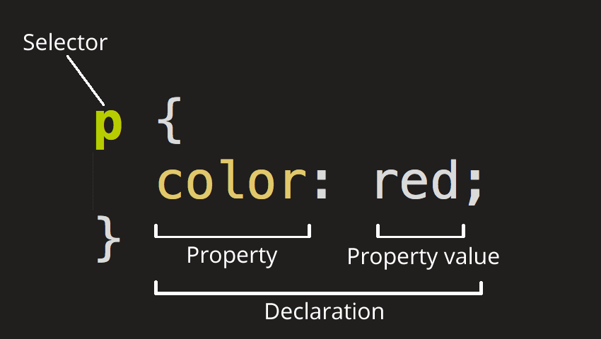
CSS is a rule-based language. A CSS rule is a set of declarations, which take the form of propertie and value pairs, associated with a selector that describes what elements in a document the rule will match. CSS properties and values are case-insensitive.
| If a property is unknown, or if a value is not valid for a given property, the declaration is processed as invalid. It is completely ignored by the browser’s CSS engine. |
In CSS (and other web standards), it has been agreed that US spelling is the standard where there is language variation or uncertainty. For example, colour should be spelled color, as colour will not work.
|
CSS comments begin with /* and end with */.
/* This is a single-line comment */
p {
  color: /*blue*/red; /* Add comments in the middle or the end of a code line */
  /* This is
     a multi-line
     comment */
  font-size: 1em;
}
1.1. At-rules
At-rules are CSS statements that begin with an at sign, '@' (U+0040 COMMERCIAL AT), followed by an identifier and includes everything up to the next semicolon, ';' (U+003B SEMICOLON), or the next CSS declaration block, whichever comes first.
-
Regular at-rules
/* General structure */ @identifier (RULE); /* Example: tells browser to use UTF-8 character set */ @charset "utf-8"; -
Nested at-rules
@identifier (RULE) {
}
A subset of nested statements, which can be used as a statement of a style sheet as well as inside of conditional group rules that share a common syntax and each of them can include nested statements—either rulesets or nested at-rules.
/* At the top level of your code */
@media screen and (min-width: 900px) {
  article {
    padding: 1rem 3rem;
  }
}

/* Nested within another conditional at-rule */
@supports (display: flex) {
  @media screen and (min-width: 900px) {
    article {
      display: flex;
    }
  }
}
1.2. Scoped style rules
The @scope at-rule is still incompatible in Mozilla Firefox.
|
The @scope at-rule contains scoped style rules and defines a scope in which to apply them to selected elements in specific DOM subtrees. @scope can be used in two ways:
-
As a standalone CSS block including a prelude section that includes scope root and optional scope limit selectors that define the upper and lower bounds of the scope — commonly referred to as a donut scope.
@scope (scope root) to (scope limit) { rulesets } -
As inline styles included inside a
<style>element in the HTML, in which case the prelude is omitted, and the enclosed ruleset is automatically scoped to the<style>element’s enclosing parent element.<parent-element> <style> @scope { rulesets } </style> </parent-element>
In the context of a @scope block, the :scope pseudo-class represents the scope root — it provides an easy way to apply styles to the scope root itself, from inside the scope:
@scope (.feature) {
  :scope {
    background: rebeccapurple;
    color: antiquewhite;
    font-family: sans-serif;
  }
}
1.3. CSS prefixes
Browser vendors used to add prefixes to experimental or nonstandard CSS properties.
-
-webkit-(Chrome, Safari, newer versions of Opera and Edge, almost all iOS browsers including Firefox for iOS; basically, any WebKit or Chromium-based browser) -
-moz-(Firefox) -
-o-(old pre-WebKit versions of Opera) -
-ms-(Internet Explorer and Microsoft Edge, before Chromium)
1.4. External, internal, and inline stylesheet

-
An external stylesheet contains CSS in a separate file with a
.cssextension inside the<head>HTML element, which is the most common and useful method of bringing CSS to a document.<!-- Inside a subdirectory called styles inside the current directory --> <link rel="stylesheet" href="styles/style.css" /> <!-- Inside a subdirectory called general, which is in a subdirectory called styles, inside the current directory --> <link rel="stylesheet" href="styles/general/style.css" /> <!-- Go up one directory level, then inside a subdirectory called styles --> <link rel="stylesheet" href="../styles/style.css" /> <!-- Remote URL links --> <link rel="stylesheet" href="https://cdn.jsdelivr.net/npm/bootstrap@5.3.3/dist/css/bootstrap.min.css" integrity="sha384-QWTKZyjpPEjISv5WaRU9OFeRpok6YctnYmDr5pNlyT2bRjXh0JMhjY6hW+ALEwIH" crossorigin="anonymous" />The relstands for "relationship", and is one of the key features of the<link>element — the value denotes how the item being linked to is related to the containing document. -
An internal stylesheet resides within an HTML document inside a
<style>element.The <style>element MUST? be included inside the <head> of the document. In general, it is better to put the styles in external stylesheets and apply them using<link>elements.<!DOCTYPE html> <html lang="en-GB"> <head> <meta charset="utf-8" /> <title>My CSS experiment</title> <style> h1 { color: blue; background-color: yellow; border: 1px solid black; } p { color: red; } </style> </head> <body> <h1>Hello World!</h1> <p>This is my first CSS example</p> </body> </html> -
The inline styles are CSS declarations that affect a single HTML element, contained within a
styleattribute.Note that it is recommended for styles to be defined in a separate file or files. <h1 style="color: blue; background-color: yellow; border: 1px solid black;"> Hello World! </h1> <p style="color:red;">This is my first CSS example</p>
2. Selectors
A CSS selector is a pattern of elements and other terms that tell the browser which HTML elements, subject of the selector, should be selected to have the CSS property values inside the rule applied to them. .
2.1. Universal selectors
-
The universal selector is indicated by an asterisk (
*). It selects everything in the document (or inside the parent element if it is being chained together with another element and a descendant combinator)./* A reset stylesheet to remove the margins on all elements. */ * { margin: 0; }/* It is selecting any element which is the first-child of an <article> element, or the first-child of any descendant element of <article>. */ article *:first-child { font-weight: bold; }
2.2. Type, class, and ID selectors
-
The type selector matches elements by node name, which is sometimes referred to as a tag name selector or element selector because it selects an HTML tag/element in the document.
span {
  background-color: yellow;
}

strong, em {
  color: rebeccapurple;
}
-
The class selector matches elements based on the contents of their
classattribute./* Note that the following class selector */ .class_name { /* style properties */ } /* is equivalent to the following attribute selector */ [class~=class_name] { /* style properties */ }/* All elements with class="spacious" */ .spacious { margin: 2em; } /* All <li> elements with class="spacious" */ li.spacious { margin: 2em; } /* All <li> elements with a class list that includes both "spacious" and "elegant" */ /* For example, class="elegant retro spacious" */ li.spacious.elegant { margin: 2em; }
-
The ID selector matches an element based on the value of the element’s
idattribute which is case-sensitive./* Note that syntactically (but not specificity-wise), the following ID selector */ #id_value { /* style properties */ } /* is equivalent to the following attribute selector */ [id=id_value] { /* style properties */ }/* The element with id="demo" */ #demo { border: red 2px solid; }Using the same ID multiple times in a document may appear to work for styling purposes, but don’t do this. It results in invalid code, and will cause strange behavior in many places.
2.3. Attribute selectors
The attribute selector matches elements based on the element having a given attribute explicitly set, with options for defining an attribute value or substring value match.
-
The presence and value selectors enable the selection of an element based on the presence of an attribute alone (for example
href), or on various different matches against the value of the attribute.Selector Example Description [attr]a[title]Matches elements with an attr attribute (whose name is the value in square brackets).
[attr=value]a[href="https://example.com"]Matches elements with an attr attribute whose value is exactly value — the string inside the quotes.
[attr~=value]p[class~="special"]Matches elements with an attr attribute whose value is exactly value, or contains value in its (space separated) list of values.
[attr|=value]div[lang|="zh"]Matches elements with an attr attribute whose value is exactly value or begins with value immediately followed by a hyphen.
-
The substring matching selectors allow for more advanced matching of substrings inside the value of a attribute.
Selector Example Description [attr^=value]li[class^="box-"]Matches elements with an attr attribute, whose value begins with value.
[attr$=value]li[class$="-box"]Matches elements with an attr attribute whose value ends with value.
[attr*=value]li[class*="box"]Matches elements with an attr attribute whose value contains value anywhere within the string.
To match attribute values case-insensitively, use the value ibefore the closing bracket.Example
li[class^="a"] { background-color: yellow; } li[class^="a" i] { color: red; }<h1>Case-insensitivity</h1> <ul> <li class="a">Item 1</li> <li class="A">Item 2</li> <li class="Ab">Item 3</li> </ul>Case-insensitivity
- Item 1
- Item 2
- Item 3
2.4. Pseudo-classes and pseudo-elements
-
A pseudo-class is a selector that selects elements that are in a specific state, e.g. they are the first element of their type, or they are being hovered over by the mouse pointer.
-
Pseudo-classes are keywords that start with a colon
:. For example, both:first-childand:hoverare pseudo-classes./* target the first paragraph child element in all article. */ article p:first-child { font-size: 120%; font-weight: bold; } -
It is valid to write pseudo-classes and elements without any element selector preceding them.
In the example above, write
:first-childand the rule would apply to any element that is the first child of an<article>element, not just a paragraph first child —:first-childis equivalent to*:first-child.article :first-child { font-size: 120%; font-weight: bold; }article *:first-child { font-size: 120%; font-weight: bold; } -
The user-action pseudo-classes, sometimes referred to as dynamic pseudo-classes, act as if a class had been added to the element when the user interacts with it.
Example
a:link, a:visited {
  color: rebeccapurple;
  font-weight: bold;
}

a:hover {
  color: hotpink;
}
<p><a href="">Hover over me</a></p>
-
-
Pseudo-elements behave in a similar way. However, they act as if a whole new HTML element is added into the markup, rather than applying a class to existing elements.
Some early pseudo-elements used the single colon syntax. Modern browsers support the early pseudo-elements with single- or double-colon syntax for backwards compatibility. -
Pseudo-elements start with a double colon
::. For example, both the::fist-line, and::beforeare pseudo-elements.Example
/* select the first line of a paragraph of an article */
article p::first-line {
  font-size: 120%;
  color: red;
}
Veggies es bonus vobis, proinde vos postulo essum magis kohlrabi welsh onion daikon amaranth tatsoi tomatillo melon azuki bean garlic.
Gumbo beet greens corn soko endive gumbo gourd. Parsley shallot courgette tatsoi pea sprouts fava bean collard greens dandelion okra wakame tomato. Dandelion cucumber earthnut pea peanut soko zucchini.
-
Combining pseudo-classes and pseudo-elements
/*  make the first line of the first paragraph bold */
article p:first-child::first-line {
  font-size: 120%;
  font-weight: bold;
}
-
-
The
::beforeand::afterare a couple of special pseudo-elements as the first and the last child of the selected element, which are used along with the content property to insert content into the document using CSS.Example
.topic-weather::before {
  content: '⛅ ';
}

.topic-weather::after {
  content: " ➥";
}

.topic-hot::before {
  content: url('https://interactive-examples.mdn.mozilla.net/media/examples/fire.png');
  margin-right: 6px;
}
<p class="topic-weather">Weather for Today: Heat, violent storms and twisters</p> <p class="topic-hot">Trending Article: Must-watch videos of the week</p>Weather for Today: Heat, violent storms and twisters
Trending Article: Must-watch videos of the week
2.5. Combinators
-
The descendant combinator — typically represented by a single space (
" ") character — combines two selectors such that elements matched by the second selector are selected if they have an ancestor (parent, parent’s parent, parent’s parent’s parent, etc.) element matching the first selector. Selectors that utilize a descendant combinator are called descendant selectors.body article p { /* */ }
-
The child combinator (
>) is placed between two CSS selectors. It matches only those elements matched by the second selector that are the direct children of elements matched by the first. Descendant elements further down the hierarchy don’t match./* select only <p> elements that are direct children of <article> elements */ article > p { /* */ }
-
The next-sibling combinator (
+) is placed between two CSS selectors. It matches only those elements matched by the second selector that are the next sibling element of the first selector./* select all <img> elements that are immediately preceded by a <p> element */ p + img { /* */ }Example
h1 + p {
  font-weight: bold;
  background-color: #333;
  color: #fff;
  padding: .5em;
}
<article> <h1>A heading</h1> <p>I am a paragraph.</p> <div>I am a div</div> <p>I am another paragraph.</p> </article>
-
The subsequent-sibling combinator (
~) are used to select siblings of an element even if they are NOT directly adjacent./* select all <img> elements that come anywhere after <p> elements */ p ~ img { /* */ }Example
h1 ~ p {
  font-weight: bold;
  background-color: #333;
  color: #fff;
  padding: .5em;
}
<article> <h1>A heading</h1> <p>I am a paragraph.</p> <div>I am a div</div> <p>I am another paragraph.</p> </article>A heading
I am a paragraph.
I am a divI am another paragraph.
-
The selector list (
,), a comma-separated list of selectors, selects all the matching nodes.-
When multiple selectors share the same declarations, they can be grouped together into a comma-separated list.
span { border: red 2px solid; } div { border: red 2px solid; } /* are equivalent to */ span, div { border: red 2px solid; } -
Selector lists can also be passed as parameters to some functional CSS pseudo-classes.
:is(span, div) { border: red 2px solid; } -
When a selector list contains an invalid selector, the entire style block is ignored.
h1, h2:invalid-pseudo, h3 {
  color: blue;
}
-
2.6. Nesting selector (&)
-
The
&nesting selector explicitly states the relationship between parent and child rules when using CSS nesting, and makes the nested child rule selectors relative to the parent element.parentRule { /* parent rule style properties */ & childRule { /* child rule style properties */ } } -
Without the
&nesting selector, whitespace is added, and the child rule selector selects child elements..parent-rule { /* parent rule properties */ .child-rule { /* child rule properties */ } } /* the browser parses the above nested rules as shown below */ .parent-rule { /* parent rule style properties */ } .parent-rule .child-rule { /* style properties for .child-rule descendants for .parent-rule ancestors */ } -
With the
&nesting selector added with no whitespace..parent-rule { /* parent rule properties */ &:hover { /* child rule properties */ } } /* the browser parses the above nested rules as shown below */ .parent-rule { /* parent rule properties */ } .parent-rule:hover { /* child rule properties */ } -
The
&nesting selector can also be appended to reverse the context of the rules..card { /* .card styles */ .featured & { /* .featured .card styles */ } } /* the browser parses above nested rules as */ .card { /* .card styles */ } .featured .card { /* .featured .card styles */ } -
CSS Combinators can be used with or without the
&nesting selector./* the & nesting selector is not required, but recommended */ p { & ~ img { } } /* the browser parses above nested rules as */ p ~ img { }Details
<div class="nesting-selector">
  <style>
    .nesting-selector {
      .example {
        font-family: system-ui;
        font-size: 1.2rem;

        &>a {
          color: tomato;

          &:hover,
          &:focus {
            color: ivory;
            background-color: tomato;
          }
        }
      }
    }
  </style>

  <p class="example">
    This paragraph <a href="#">contains a link</a>, try hovering or focusing it.
  </p>
</div>
This paragraph contains a link, try hovering or focusing it.
3. Cascade, specificity, and inheritance
3.1. Inheritance
In CSS, inheritance controls what happens when no value is specified for a property on an element.
-
When no value for an inherited property has been specified on an element, the element gets the computed value of that property on its parent element.
-
When no value for a non-inherited property has been specified on an element, the element gets the initial value of that property.
-
The inherit keyword allows authors to explicitly specify inheritance. It works on both inherited and non-inherited properties.
-
The
allshorthand property resets all of an element’s properties exceptunicode-bidi,direction, and CSS Custom Properties.It can set properties to their initial or inherited values, or to the values specified in another cascade layer or stylesheet origin.
Details
<style>
  div.inherit p {
    all: revert;
    font-size: 1rem;
    color: green;
    border: medium solid;
    width: 50%;
  }

  div.inherit p em.inherit {
    border: inherit;
  }
</style>

<div class="inherit">
  <p>This paragraph has <em>emphasized text</em> in it.</p>
  <p>This paragraph has <em class="inherit">emphasized text</em> in it.</p>
</div>
This paragraph has emphasized text in it.
This paragraph has emphasized text in it.
3.2. Cascade
The cascade is an algorithm that defines how user agents combine property values originating from different sources.
-
The cascade defines the origin and layer that takes precedence when declarations in more than one origin, cascade layer, or @scope block set a value for a property on an element.
-
The cascade lies at the core of CSS, as emphasized by the name: Cascading Style Sheets.
-
When a selector matches an element, the property value from the origin with the highest precedence gets applied, even if the selector from a lower precedence origin or layer has greater specificity.
3.2.1. Origin types
CSS declarations come from different origin types: User-agent stylesheets, Author stylesheets, and User stylesheets.
-
User-agents, or browsers, have basic user-agent stylesheets that give default styles to any document.
-
Web developers defines the styles using one or more linked or imported stylesheets,
<style>blocks, and inline styles defined with thestyleattribute, which are named author stylesheets. -
In most browsers, the user (or reader) of the website can choose to override styles using a custom user stylesheet designed to tailor the experience to the user’s wishes.
3.2.2. Cascade layers
The @layer CSS at-rule is used to declare a cascade layer and can also be used to define the order of precedence in case of multiple cascade layers.
/* create a named cascade layer with the CSS rules */
@layer layer-name {rules}
/* create one or multiple named cascade layers without assigning any styles */
@layer layer-name;
/* the last layer to be listed will win if declarations are found in multiple layers. */
@layer layer-name, layer-name, layer-name;
/* create an anonymous cascade layer */
@layer {rules}
/* create a cascade layer is by using @import. */
@import url layer(layer-name);-
Rules within a cascade layer cascade together, giving more control over the cascade to web developers.
-
Any styles not in a layer are gathered together and placed into a single anonymous layer that comes after all the declared layers, named and anonymous.
-
Any styles declared outside of a layer are treated as being part of an anonymous last declared layer, and will override styles declared in a layer, regardless of specificity.
@layer base, special;

@layer special {
  .item {
    color: rebeccapurple;
  }
}

@layer base {
  .item {
    color: green;
    border: 5px solid green;
    font-size: 1.3em;
    padding: 0.5em;
  }
}
3.2.3. !important
A ! delimiter followed by the important keyword marks the declaration as important. A declaration that is not important is called normal. When a declaration is important, the cascade origin and layer orders are reversed.
selector {
  property: value; /* normal declaration */
  property: value !important; /* important declaration (preferred) */
  property: value ! important; /* important declaration (not preferred) */
}
Avoid using !important to override specificity.
|
3.2.4. Cascading order
The cascade order is based on origin type, and within each origin type, the cascade is based on the declaration order of cascade layers within that type.
The following steps apply to the cascading algorithm:
-
Relevance: It first filters all the rules from the different sources to keep only the rules that apply to a given element.
-
Origin and importance: Then it sorts these rules according to their importance, that is, whether or not they are followed by
!important, and by their origin. Ignoring layers for the moment, the cascade order is as follows:Order (low to high) Origin Importance 1
user-agent (browser)
normal
2
user
normal
3
author (developer)
normal
4
CSS
@keyframeanimations5
author (developer)
!important6
user
!important7
user-agent (browser)
!important8
CSS transitions
-
Specificity: In case of equality with an origin, the specificity of a rule is considered to choose one value or another. The specificity of the selectors are compared, and the declaration with the highest specificity wins.
-
Scoping proximity: When two selectors in the origin layer with precedence have the same specificity, the property value within scoped rules with the smallest number of hops up the DOM hierarchy to the scope root wins.
-
Order of appearance: In the origin with precedence, if there are competing values for a property that are in style block matching selectors of equal specificity and scoping proximity, the last declaration in the style order is applied.
3.3. Specificity
Specificity is the algorithm used by browsers to determine the CSS declaration that is the most relevant to an element, which in turn, determines the property value to apply to the element. The specificity algorithm calculates the weight of a CSS selector to determine which rule from competing CSS declarations gets applied to an element.
4. The box model
Everything in CSS has a box around it, and understanding these boxes is key to being able to create more complex layouts with CSS, or to align items with other items.
4.1. Block and inline boxes
In CSS boxes generally fit into the categories of block boxes and inline boxes, and have an inner display type and an outer display type.
Boxes have an inner display type, which dictates how elements inside that box are laid out, like display: flex;.
|
If a box has an outer display type of block, then:
-
The box will break onto a new line.
-
The
widthandheightproperties are respected. -
Padding, margin and border will cause other elements to be pushed away from the box.
-
If
widthis not specified, the box will extend in the inline direction to fill the space available in its container. In most cases, the box will become as wide as its container, filling up 100% of the space available. -
HTML elements, such as
<h1>and<p>, use block as their outer display type by default.
If a box has an outer display type of inline, then:
-
The box will NOT break onto a new line.
-
The
widthandheightproperties will NOT apply. -
Top and bottom padding, margins, and borders will apply but will NOT cause other inline boxes to move away from the box.
-
Left and right padding, margins, and borders will apply and will cause other inline boxes to move away from the box.
-
HTML elements, such as
<a>,<span>,<em>and<strong>use inline as their outer display type by default.
4.2. Writing modes
The writing-mode property sets whether lines of text are laid out horizontally or vertically, as well as the direction in which blocks progress. When set for an entire document, it should be set on the root element (html element for HTML documents).
/* For `ltr` scripts, content flows horizontally from left to right.
   For `rtl` scripts, content flows horizontally from right to left.
   The next horizontal line is positioned below the previous line. */
writing-mode: horizontal-tb;
/* For `ltr` scripts, content flows vertically from top to bottom, and the
   next vertical line is positioned to the left of the previous line.
   For `rtl` scripts, content flows vertically from bottom to top, and the
   next vertical line is positioned to the right of the previous line. */
writing-mode: vertical-rl;
/* For `ltr` scripts, content flows vertically from top to bottom, and the
   next vertical line is positioned to the right of the previous line.
   For `rtl` scripts, content flows vertically from bottom to top, and the
   next vertical line is positioned to the left of the previous line. */
writing-mode: vertical-lr;
Example
<style>
div.writing-mode {
  writing-mode: vertical-rl;
}
</style>
<div class='writing-mode'>
<p>歸園田居·其三</p>
<p>魏晉·陶淵明</p>
<p>種豆南山下,草盛豆苗稀。</p>
<p>晨興理荒穢,帶月荷鋤歸。</p>
<p>道狹草木長,夕露沾我衣。</p>
<p>衣沾不足惜,但使願無違。</p>
</div>
歸園田居·其三
魏晉·陶淵明
種豆南山下,草盛豆苗稀。
晨興理荒穢,帶月荷鋤歸。
道狹草木長,夕露沾我衣。
衣沾不足惜,但使願無違。
4.3. Logical properties and values
CSS logical properties and values module introduces logical properties and values that provide the ability to control layout through logical, rather than physical, direction and dimension mappings.
-
The Block dimension perpendicular to the flow of text within a line, i.e., the vertical dimension in horizontal writing modes, and the horizontal dimension in vertical writing modes. For standard English text, it is the vertical dimension.
-
The Inline dimension parallel to the flow of text within a line, i.e., the horizontal dimension in horizontal writing modes, and the vertical dimension in vertical writing modes. For standard English text, it is the horizontal dimension.
Block and inline sizes
Logical properties and values use the abstract terms block and inline to describe the direction in which they flow.
-
The
inline-sizeproperty defines the horizontal or vertical size of an element’s block, depending on its writing mode. It corresponds to either thewidthor theheightproperty, depending on the value ofwriting-mode.If the writing mode is vertically oriented, the value of
inline-sizerelates to theheightof the element; otherwise, it relates to thewidthof the element.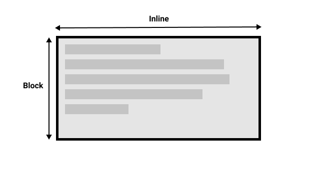 Figure 1. Showing the block and inline axis for a horizontal writing mode.
 -
The
block-sizeproperty defines the horizontal or vertical size of an element’s block, depending on its writing mode. It corresponds to either thewidthor theheightproperty, depending on the value ofwriting-mode.If the writing mode is vertically oriented, the value of
block-sizerelates to thewidthof the element; otherwise, it relates to theheightof the element.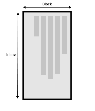 Figure 2. Showing the block and inline axis for a vertical writing mode.
 -
Properties that accept physical values (
top,bottom,left,right) now also accept flow-relative logical values (block-start,block-end,inline-start,inline-end).
4.4. Box model
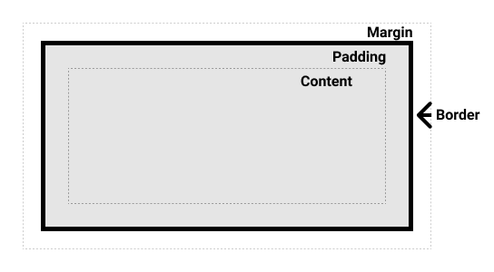
The CSS box model as a whole applies to block boxes and defines how the different parts of a box — margin, border, padding, and content — work together to create a box.
| To add complexity, there is a standard and an alternate box model. By default, browsers use the standard box model. |
-
Content area: The area where the content is displayed; size it using properties like
inline-sizeandblock-sizeorwidthandheight. -
Padding area: The padding sits around the content as white space; size it using
paddingand related properties. -
Border area: The border wraps the content and any padding; size it using
borderand related properties. -
Margin area: The margin is the outermost layer, wrapping the content, padding, and border as whitespace between this box and other elements; size it using
marginand related properties.
4.4.1. The standard box model
-
In the standard box model, if set
inline-sizeandblock-size(orwidthandheight) property values on a box, these values define theinline-sizeandblock-size(widthandheightin horizontal languages) of the content box.-
Any padding and borders are then added to those dimensions to get the total size taken up by the box.
.box { width: 350px; height: 150px; margin: 10px; padding: 25px; border: 5px solid black; }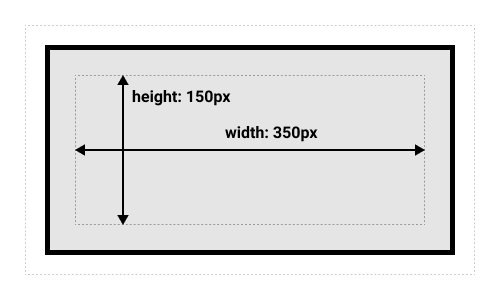 Figure 3. The actual space taken up by the box will be 410px wide (350 + 25 + 25 + 5 + 5) and 210px high (150 + 25 + 25 + 5 + 5).
The margin is not counted towards the actual size of the box — sure, it affects the total space that the box will take up on the page, but only the space outside the box. The box’s area stops at the border — it does not extend into the margin. -
4.4.2. The alternative box model
-
In the alternative box model, aka Internet Explorer box model, any width is the width of the visible box on the page.
-
The content area width is that width minus the width for the padding and border.
-
No need to add up the border and padding to get the real size of the box.
-
-
The
box-sizingproperty sets how the total width and height of an element is calculated./* The width and height properties include the content, padding, and border, but do not include the margin. Note that padding and border will be inside of the box. */ box-sizing: border-box; /* alternative box model, or Internet Explorer box model */ /* The width and height properties include the content, but does not include the padding, border, or margin. */ box-sizing: content-box; /* standard box model */ -
To turn on the alternative box model for an element, set
box-sizing: border-boxon it:.box { width: 350px; inline-size: 350px; height: 150px; block-size: 150px; margin: 10px; padding: 25px; border: 5px solid black; box-sizing: border-box; /* turn on the alternative box model */ }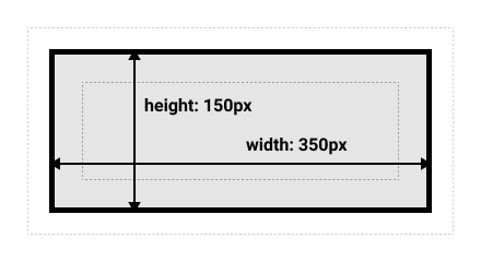 Figure 4. Now, the actual space taken up by the box will be 350px in the inline direction and 150px in the block direction.
 -
To use the alternative box model for all elements (which is a common choice among developers), set the
box-sizingproperty on the<html>element and set all other elements to inherit that value:html { box-sizing: border-box; } *, *::before, *::after { box-sizing: inherit; }
4.4.3. The box model and inline boxes
An element, such as <span>, with display: inline-block does a subset of the block things, NOT, however, break onto a new line.
-
The
widthandheightproperties are respected. -
padding,margin, andborderwill cause other elements to be pushed away from the box.Example
<div class="box-model inline-box"> <style> .box-model.inline-box { all: initial; span { vertical-align: middle; background-color: pink; border: 1px dashed red; height: 4lh; padding: 10px; margin: 10px; &.inline-block { display: inline-block; } } } </style> <p><span>あなたが教えてくれた,</span><span class="inline-block">夜にひそむやさしさ</span></p> </div>あなたが教えてくれた,夜にひそむやさしさ
4.5. Overflowing
Everything in CSS is a box, and the size can be constrained by assigning values of width and height (or inline-size and block-size). Overflow happens when there is too much content to fit in a box.
| Wherever possible, CSS does not hide content and try to avoid data loss. |
-
The
overflow-xproperty sets what shows when content overflows a block-level element’s left and right edges, which may be nothing, a scroll bar, or the overflow content. -
The
overflow-yproperty sets what shows when content overflows a block-level element’s top and bottom edges, which may be nothing, a scroll bar, or the overflow content. -
The
overflowshorthand property sets the desired behavior when content does not fit in the parent element box (overflows) in the horizontal (overflow-x) and/or vertical (overflow-y) direction./* Overflow content is not clipped and may be visible outside the element's padding box. The element box is not a scroll container. This is the default value of the overflow property. */ overflow: visible; /* Overflow content is clipped at the element's padding box. There are no scroll bars, and the clipped content is not visible, but the content still exists. */ overflow: hidden; overflow: clip; /* Overflow content is clipped at the element's padding box, and overflow content can be scrolled into view using scroll bars. User agents display scroll bars in both horizontal and vertical directions if only one value is set, whether or not any content is overflowing or clipped. */ overflow: scroll; /* Overflow content is clipped at the element's padding box, and overflow content can be scrolled into view. Unlike scroll, user agents display scroll bars only if the content is overflowing and hide scroll bars by default. */ overflow: auto; overflow: hidden visible;
-
The
overflow-wrapproperty applies to text, setting whether the browser should insert line breaks within an otherwise unbreakable string to prevent text from overflowing its line box.The property was originally a nonstandard and unprefixed Microsoft extension called word-wrap, and was implemented by most browsers with the same name. It has since been renamed tooverflow-wrap, withword-wrapbeing an alias./* Lines may only break at normal word break points (such as a space between two words). */ overflow-wrap: normal; /* To prevent overflow, an otherwise unbreakable string of characters — like a long word or URL — may be broken at any point if there are no otherwise-acceptable break points in the line. No hyphenation character is inserted at the break point. Soft wrap opportunities introduced by the word break are considered when calculating min-content intrinsic sizes. */ overflow-wrap: anywhere; /* The same as the anywhere value, with normally unbreakable words allowed to be broken at arbitrary points if there are no otherwise acceptable break points in the line, but soft wrap opportunities introduced by the word break are NOT considered when calculating min-content intrinsic sizes. */ overflow-wrap: break-word;The differences between
normal,break-wordandanywhereare only clear if you are usingwidth: min-contenton the element containing the text, and you also set amax-width.Example
<style> div.overflow-wrap p { width: min-content; max-width: 5em; background-color: lightblue; } div.overflow-wrap p.normal { overflow-wrap: normal; } div.overflow-wrap p.break-word { overflow-wrap: break-word; } div.overflow-wrap p.break-word.hyphens { overflow-wrap: break-word; hyphens: auto; } div.overflow-wrap p.anywhere { overflow-wrap: anywhere; } </style> <div class="overflow-wrap" lang="en-US"> <p class="overflow-wrap normal"> Gooooooooogle </p> <p class="overflow-wrap break-word"> Gooooooooogle </p> <p class="overflow-wrap break-word hyphens"> Goooooo­ooogle <!-- use ­ to insert a soft hyphen --> </p> <p class="overflow-wrap anywhere"> Gooooooooogle </p> </div>Gooooooooogle
Gooooooooogle
Gooooooooogle
Gooooooooogle
5. Values and units
CSS rules contain declarations, which in turn are composed of properties and values. Each property used in CSS has a value type that describes what kind of values it is allowed to have.
| The terms value type and data type are basically interchangeable, and the term value refers to any particular expression supported by a value type |
CSS value types tend to be enclosed in angle brackets (<, >) to differentiate them from CSS properties. For example there is a color property and a <color> data type.
|
/*  The keywords, hex values, rgb() functions, etc, can be available <color> values */
h1 {
  color: black; /* keywords */
  background-color: rgb(197 93 161); /* rgb() functions */
  border-color: #128a7d; /* hex values */
}
5.1. Numbers, lengths, and percentages
| Data type | Description |
|---|---|
|
An |
|
A |
|
A
|
|
A Percentage values are always relative to another quantity. For example, an element’s length is relative to its parent element’s length. |
The <length> data type represents a distance value which can be relative or absolute. Lengths can be used in numerous CSS properties, such as width, height, margin, padding, border-width, font-size, and text-shadow.
-
CSS relative length units are based on font, container, or viewport sizes.
-
emandremare relative to the font size of the parent element and the root element, respectively. -
vhandvware relative to the viewport’s height and width, respectively. -
cqwandcqhrepresents a percentage of the width and height of the query container, respectively. -
lhandrlhis equal to the computed value of theline-heightproperty of the element itself, and the root element, usually<html>, respectively.
-
-
Absolute length units represent a physical measurement when the physical properties of the output medium are known, such as for print layout.
Unit Name Equivalent to cmCentimeters
1cm = 37.8px = 25.2/64in
inInches
1in = 2.54cm = 96px
ptPoints
1pt = 1/72nd of 1in
pxPixels
1px = 1/96th of 1in
The most of these units are more useful when used for print, rather than screen output. Many users increase their user agent’s default font size to make text more legible. Absolute lengths can cause accessibility problems because they are fixed and do not scale according to user settings. For this reason, prefer relative lengths (such as emorrem) when settingfont-size.
CSS also has functions, which work in a similar way to functions in other languages, which are statements that invoke special data processing or calculations to return a CSS value for a property.
background-image: url("star.gif");
background: rgb(31 120 50);
width: calc(100% - 80px);
6. Intrinsic and extrinsic sizes
HTML Elements have a natural size or intrinsic size, set before they are affected by any CSS styles or HTML attributes.
-
An
<image>contains sizing information, described as its intrinsic size, determined by the image file itself. -
An
<div>, on the other hand, has no size of its own, and its intrinsic size is defined by its content.
A size referred to as an extrinsic size— give it specific width and height values, can be given to an element (the content of which then needs to fit into that size)
-
If give a child box a percentage width it will be a percentage of the width of its parent container.
-
When use margin and padding set in percentages, the value is calculated from the inline size of the containing block — therefore the width when working in a horizontal language.
.box { border: 5px solid darkblue; /* give the child box a percentage width it will be a percentage of the width of the parent container */ width: 50%; /* the margins and padding have equal-sized all around the box. */ margin: 10%; padding: 10%; } -
A common use of
max-widthis to cause images to scale down if there is not enough space to display them at their intrinsic width while making sure they don’t become larger than that width.Example
If instead use
max-width: 100%, and its intrinsic width is smaller than its container, the image will not be forced to stretch and become larger, thus preventing pixelation.<style> div.min-max-size div { float: left; border: 5px solid darkblue; margin: 5px; } div.min-max-size div.box { width: 200px; } div.min-max-size div.minibox { width: 50px; } div.min-max-size img.width { width: 100%; } div.min-max-size img.max { max-width: 100%; } </style> <div class="min-max-size"> <div class="box"> <img class="width" src="https://mdn.github.io/css-examples/learn/sizing/star.png" alt="star" /> </div> <div class="box"> <img class="max" src="https://mdn.github.io/css-examples/learn/sizing/star.png" alt="star" /> </div> <div class="minibox"> <img class="max" src="https://mdn.github.io/css-examples/learn/sizing/star.png" alt="star" /> </div> </div> <div style="clear: both"></div>
7. Font families
The CSS properties used to style text generally fall into two categories:
-
Font styles: Properties that affect a text’s font, e.g., which font gets applied, its size, and whether it’s bold, italic, etc.
-
Text layout styles: Properties that affect the spacing and other layout features of the text, allowing manipulation of, for example, the space between lines and letters, and how the text is aligned within the content box.
The font-family property specifies a prioritized list of one or more font family names and/or generic family names, separated by commas to indicate that they are alternatives, for the selected element.
-
Font selection is done one character at a time, so that if an available font does NOT have a glyph for a needed character, the latter fonts are tried.
-
When a font is only available in some styles, variants, or sizes, those properties may also influence which font family is chosen.
-
Generic font families are keywords and MUST not be quoted, which is a fallback mechanism, a means of preserving some of the style sheet author’s intent when none of the specified fonts are available.
-
serif,sans-serif,system-uiandmonospaceare quite predictable and should provide something reasonable. -
cursiveandfantasyare less predictable and recommended using them very carefully, testing as you go.
-
-
It is a good practice to quote font family names that contain white space, digits, or punctuation characters other than hyphens.
/* GitHub, Wordpress, Bootstrap, Medium, Ghost, etc. See: https://github.com/necolas/normalize.css/issues/665 https://bitsofco.de/the-new-system-font-stack/ */ font-family: -apple-system,system-ui,BlinkMacSystemFont,"Segoe UI",Roboto,"Helvetica Neue",Arial,sans-serif-
-apple-systemtargetsSan Franciscoin Safari (on Mac OS X and iOS), and it targetsNeue HelveticaandLucida Grandeon older versions of Mac OS X. It properly selects betweenSan Francisco TextandSan Francisco Displaydepending on the text’s size. -
system-uirepresents the default UI font on a given platform. -
BlinkMacSystemFontis the equivalent to-apple-systemfor Chrome on Mac OS X. -
Segoe UItargets Windows and Windows Phone. -
Robototargets Android and newer Chrome OS. It is deliberately listed afterSegoe UIso that if you’re an Android developer on Windows and have Roboto installed,Segoe UIwill be used instead.
-
-
Fonts that are ONLY generally available across all systems are so-called web safe fonts.
Table 2. The list of actual web safe fonts will change as operating systems evolve, but it’s reasonable to consider the following fonts web safe, at least for now. Name Generic type Notes Arialsans-serifIt’s often considered best practice to also add
Helveticaas a preferred alternative toArialas, although their font faces are almost identical,Helveticais considered to have a nicer shape, even ifArialis more broadly available.Courier NewmonospaceSome OSes have an alternative (possibly older) version of the
Courier Newfont calledCourier. It’s considered best practice to use both withCourier Newas the preferred alternative.GeorgiaserifTimes New RomanserifSome OSes have an alternative (possibly older) version of the
Times New Romanfont calledTimes. It’s considered best practice to use both withTimes New Romanas the preferred alternative.Trebuchet MSsans-serifYou should be careful with using this font — it isn’t widely available on mobile OSes.
Verdanasans-serif
8. Custom properties (--*): CSS variables
Property names that are prefixed with --, like --example-name, represent custom properties or variables that contain a value that can be used in other declarations using the var() function. It’s scoped to the declared on element(s), and participate in the cascade.
-
A common practice is to define custom properties on the
:rootpseudo-class, so that it can be referenced globally:root { --main-bg-color: pink; } body { background-color: var(--main-bg-color); } -
A custom property defined using two dashes
--instead of@propertyalways inherits the value of its parent.<div class="one"> <p>One</p> <div class="two"> <p>Two</p> <div class="three"><p>Three</p></div> <div class="four"><p>Four</p></div> </div> </div>div { background-color: var(--box-color); /* class="one": invalid value, which is the default value of a custom property defined in this way class="two": cornflowerblue class="three": aquamarine class="four": cornflowerblue (inherited from its parent) */ } .two { --box-color: cornflowerblue; } .three { --box-color: aquamarine; } -
Referencing custom properties using
var()with fallback valuesbody { /* custom properties with fallbacks for use when the property has not been set */ color: var(--main-fg-color, blue); /* using a custom property as a fallback */ background-color: var(--main-bg-color, var(--backup-bg-color, white)); }
9. Layout
CSS page layout techniques are used to take elements contained in a web page and control where they’re positioned relative to the following factors:
-
their default position in normal layout flow,
-
the other elements around them,
-
their parent container,
-
and the main viewport/window.
9.1. Flow layout
Normal Flow, or Flow Layout, is the way that Block and Inline elements are displayed on a page before any changes are made to their layout.
-
By default, a block-level element's content fills the available inline space of the parent element containing it, growing along the block dimension to accommodate its content, and the size of inline-level elements is just the size of their content.
-
By default, block-level elements are laid out in the block flow direction based on the parent’s writing mode.
-
Each element will appear on a new line below the last one, with each one separated by whatever margin that’s been specified.
-
The vertical direction
topandbottommargins of blocks are sometimes combined (collapsed) into a single margin whose size is the largest of the individual margins, a behavior known as margin collapsing.Note that the margins of floating and absolutely positioned elements never collapse.
-
-
Inline elements don’t appear on new lines; instead, they all sit on the same line along with any adjacent (or wrapped) text content as long as there is space for them to do so inside the width of the parent block level element, otherwise, the overflowing content will move down to a new line.
9.2. Display and visibility
The display property sets whether an element is treated as a block or inline box and the layout used for its children, such as flow layout, grid or flex.
Formally, the display property sets an element’s inner and outer display types. The outer type sets an element’s participation in flow layout; the inner type sets the layout of children.
When browsers that support multi-keyword syntax encounter a display property that only has an outer value (e.g., display: block or display: inline), the inner value is set to flow (e.g., display: block flow and display: inline flow).
|
When browsers that support multi-keyword syntax encounter a display property that only has an inner value (e.g., display: flex or display: grid), the outer value is set to block (e.g., display: block flex and display: block grid).
|
|
CSS 2 used a single-keyword, precomposed syntax for the display property, requiring separate keywords for block-level and inline-level variants of the same layout mode. |
-
The
noneturns off the display of an element so that it has no effect on layout (the document is rendered as though the element did not exist). To have an element take up the space that it would normally take, but without actually rendering anything, use the visibility property instead.visibility: visible; visibility: hidden; visibility: collapse;
9.3. Flexbox
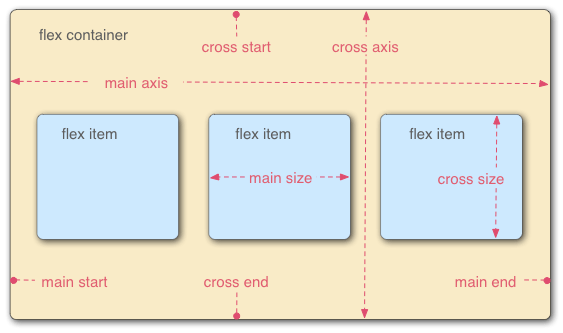
Flexbox is the short name for the Flexible Box Layout that defines the one-dimensional flex layout model, and the children can be laid out in any direction, and can "flex" their sizes, either growing to fill unused space or shrinking to avoid overflowing the parent.
-
When elements are laid out as flex items, they are laid out along two axes:
-
The main axis is the axis running in the flow direction the flex items are laid out in (for example, as a
rowacross the page, or acolumndown the page.)-
The start and end of the main axis are called the main start and main end.
-
-
The cross axis is the axis running perpendicular to the flow direction the flex items are laid out in.
-
The start and end of the cross axis are called the cross start and cross end.
-
-
The parent element that has
display: flexset on it is called the flex container. -
The items laid out as flexible boxes inside the flex container are called flex items.
-
-
Flexbox provides a property called
flex-directionthat specifies which direction the main axis runs (which direction the flexbox children are laid out in).
-
The
flex-wrapproperty sets whether flex items are forced onto one line which may cause the flex container to overflow, or can wrap onto multiple lines on stack.
-
The
flex-flowshorthand property specifies the direction of a flex container, as well as its wrapping behavior./* flex-flow: <'flex-direction'> */ flex-flow: row; /* flex-flow: <'flex-wrap'> */ flex-flow: nowrap; /* flex-flow: <'flex-direction'> and <'flex-wrap'> */ flex-flow: column wrap;
-
The
flex-basisproperty sets the initial main size, either width or height of the item which is dependent on the direction, of a flex item. It sets the size of the content box unless otherwise set withbox-sizing.In case both flex-basis(other thanauto) andwidthorheightare set for an element,flex-basishas priority.
-
The
flex-growproperty sets the flex grow factor, which specifies how much of the flex container’s remaining space should be assigned to the flex item’s main size.When the flex-container’s main size is larger than the combined main sizes of the flex items, the extra space is distributed among the flex items, with each item growth being their growth factor value as a proportion of the sum total of all the container’s items' flex grow factors.
-
The
flex-shrinkproperty sets the flex shrink factor of a flex item if the size of all flex items is larger than the flex container.Example
<div class="flexbox flex-shrink">
  <style>
    .flexbox.flex-shrink {
      all: initial;

      div.content {
        display: flex;
        width: 500px;

        div {
          flex-basis: 150px;
          border: 3px solid rgb(0 0 0 / 20%);
          box-sizing: border-box;
        }
      }

      .box {
        flex-shrink: 1;
      }

      .box1 {
        flex-shrink: 2;
      }

    }
  </style>
  <p>The width of content is 500px; the flex-basis of the flex items is 150px.</p>
  <p>A, B, C have flex-shrink:1 set. D and E have flex-shrink:2 set</p>
  <p>The width of D and E is less than the others.</p>
  <div class="content">
    <div class="box" style="background-color:red;">A</div>
    <div class="box" style="background-color:lightblue;">B</div>
    <div class="box" style="background-color:yellow;">C</div>
    <div class="box1" style="background-color:brown;">D</div>
    <div class="box1" style="background-color:lightgreen;">E</div>
  </div>
</div>
The width of content is 500px; the flex-basis of the flex items is 150px.
A, B, C have flex-shrink:1 set. D and E have flex-shrink:2 set
The width of D and E is less than the others.
ABCDE
-
The
flexshorthand property sets how a flex item will grow or shrink to fit the space available in its flex container.Example
-
In Flexbox, the
align-itemsproperty controls the alignment of items on the Cross Axis.-
By default, the value is
stretch, which stretches all flex items to fill the parent in the direction of the cross axis. -
If the parent doesn’t have a fixed height in the cross axis direction, then all flex items will become as tall as the tallest flex item.
-
-
The
align-selfproperty overrides a grid or flex item’salign-itemsvalue.
-
The CSS
justify-contentproperty defines how the browser distributes space between and around content items along the main-axis of a flex container, and the inline axis of a grid container.
9.4. Grids
CSS grid layout is a two-dimensional grid layout system, that is a set of intersecting horizontal and vertical lines defining columns and rows. Elements can be placed onto the grid within these column and row lines.
-
A grid container is created by declaring
display: gridordisplay: inline-gridon an element, and all direct children of that element become grid items..container { display: grid; /* a single column grid */ }<div class="container"> <div>One</div> <div>Two</div> <div>Three</div> <div>Four</div> <div>Five</div> </div>Example
OneTwoThreeFourFive
-
A grid track is the space between any two adjacent lines on the grid, that is defined with the grid-template-rows and grid-template-columns properties.
.container {
  display: grid;
  /* mixing flexible and absolute sizes */
  grid-template-columns: 2fr 50px repeat(2, 1fr);
}
The frunit represents a fraction of the available space in the grid container.Example
OneTwoThreeFourFive-
The size of tracks created in the implicit grid can be defined with the grid-auto-rows and grid-auto-columns properties.
.container {
  display: grid;
  grid-template-columns: repeat(3, 1fr);
  grid-auto-rows: minmax(100px, auto);
}
<div class="container"> <div>One</div> <div> Two <p>I have some more content in.</p> <p>This makes me taller than 100 pixels.</p> </div> <div>Three</div> <div>Four</div> <div>Five</div> </div>Example
OneTwoI have some more content in.
This makes me taller than 100 pixels.
ThreeFourFive
-
-
Grid items can also be positioned with numbered or named grid lines by
grid-columnandgrid-row. Lines are numbered according to the writing mode of the document.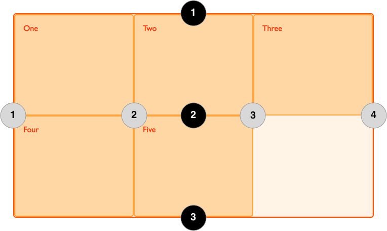 Figure 5. Three column, two row grid, three row and four column lines.
-
A grid cell is the smallest unit on a grid. Conceptually it is like a table cell.
-
Items can span one or more cells both by row or by column, and can also occupy the same cell, which creates a grid area that is one or more grid cells that make up a rectangular area on the grid.
-
In the overlapping items stack, the layer order can be controlled with the
z-indexproperty.
-
Gutters or alleys between grid cells can be created using the column-gap and row-gap properties, or the shorthand gap.
.container {
  display: grid;
  grid-template-columns: repeat(3, 1fr);
  grid-auto-rows: minmax(50px, auto);
  column-gap: 10px;
  row-gap: 1em;
}

.box1 {
  grid-column: 1 / 4;
  grid-row: 1 / 3;
}

.box2 {
  grid-column: 1;
  grid-row: 3 / 5;
}
<div class="container"> <div class="box1">One</div> <div class="box2">Two</div> <div class="box3">Three</div> <div class="box4">Four</div> <div class="box5">Five</div> </div>Example
OneTwoThreeFourFive -
9.5. Floats
The float property was introduced to allow web developers to implement layouts involving an image floating inside a column of text, with the text wrapping around the left or right of it. But web developers quickly realized that it can float anything, not just images, so the use of float broadened, for example, to fun layout effects such as drop-caps.
-
The
floatproperty places an element on the left or right side of its container, allowing text and inline elements to wrap around it.-
A floating element is one where the computed value of
floatis notnone, and implicitly use theblocklayout. -
When an element is floated, it is taken out of the normal flow of the document (though still remaining part of it), and is shifted to the left, or right, until it touches the edge of its containing box, or another floated element.
Example
<section>
  <div class="left">1</div>
  <div class="left">2</div>
  <div class="right">3</div>
  <p>
    Lorem ipsum dolor sit amet, consectetur adipiscing elit. Morbi tristique
    sapien ac erat tincidunt, sit amet dignissim lectus vulputate. Donec id
    iaculis velit. Aliquam vel malesuada erat. Praesent non magna ac massa
    aliquet tincidunt vel in massa. Phasellus feugiat est vel leo finibus
    congue.
  </p>
</section>
section { box-sizing: border-box; border: 1px solid blue; max-width: 55%; float: left; } div { margin: 5px; width: 50px; height: 150px; } .left { float: left; background: pink; } .right { float: right; background: cyan; }123Lorem ipsum dolor sit amet, consectetur adipiscing elit. Morbi tristique sapien ac erat tincidunt, sit amet dignissim lectus vulputate. Donec id iaculis velit. Aliquam vel malesuada erat. Praesent non magna ac massa aliquet tincidunt vel in massa. Phasellus feugiat est vel leo finibus congue.
-
-
The
clearproperty sets whether an floating and non-floating element must be moved below (cleared) floating elements that precede it.-
When applied to non-floating blocks, it moves the border edge of the element down until it is below the margin edge of all relevant floats, and collapses its top margin.
-
When applied to floating elements, the margin edge of the bottom element is moved below the margin edge of all relevant floats, and the vertical margins between two floated elements will NOT collapse
p {
  clear: both;
}
Example
123Lorem ipsum dolor sit amet, consectetur adipiscing elit. Morbi tristique sapien ac erat tincidunt, sit amet dignissim lectus vulputate. Donec id iaculis velit. Aliquam vel malesuada erat. Praesent non magna ac massa aliquet tincidunt vel in massa. Phasellus feugiat est vel leo finibus congue.
-
-
The
display: flow-rootlets an element generate a block box that establishes a new block formatting context, defining where the formatting root lies.-
If an element contains only floated elements, its height collapses to nothing.
-
If you want it to always be able to resize, so that it contains floating elements inside it, set the value of the element’s display property to
flow-root.#container { display: flow-root; }
-
9.6. Positioning
The position property sets how an element is positioned, and the top, right, bottom, and left properties determine the final location of positioned elements.
-
The
static, that is the default value, element is positioned according to the normal flow of the document, and thetop,right,bottom,left, andz-indexproperties have no effect. -
The
relativeelement is positioned according to the normal flow of the document, and then offset relative to itself based on the values oftop,right,bottom, andleft.-
The offset does not affect the position of any other elements; thus, the space given for the element in the page layout is the same as if position were
static. -
It creates a new stacking context when the value of
z-indexis notauto. Its effect ontable-*-group,table-row,table-column,table-cell, andtable-captionelements is undefined.
-
-
The
absoluteelement is removed from the normal document flow, and no space is created for the element in the page layout.-
The element is positioned relative to its closest positioned ancestor (if any) or to the initial containing block.
-
Its final position is determined by the values of
top,right,bottom, andleft. -
It creates a new stacking context when the value of
z-indexis notauto. -
The margins of absolutely positioned boxes do not collapse with other margins.
-
-
The
fixed;element is removed from the normal document flow, and no space is created for the element in the page layout.-
The element is positioned relative to its initial containing block, which is the viewport in the case of visual media. Its final position is determined by the values of
top,right,bottom, andleft. -
It always creates a new stacking context.
-
In printed documents, the element is placed in the same position on every page.
-
-
The
stickyelement is positioned according to the normal flow of the document, and then offset relative to its nearest scrolling ancestor and containing block (nearest block-level ancestor), including table-related elements, based on the values oftop,right,bottom, andleft.-
The offset does not affect the position of any other elements.
-
It always creates a new stacking context.
-
Note that a sticky element "sticks" to its nearest ancestor that has a "scrolling mechanism" (created when
overflowishidden,scroll,auto, oroverlay), even if that ancestor isn’t the nearest actually scrolling ancestor.
-
-
The
z-indexproperty sets the z-order of a positioned element and its descendants or flex and grid items, and overlapping elements with a larger z-index cover those with a smaller one.
9.7. Multi-column layout
Multi-column layout, usually referred to as multicol layout, is a specification for laying out content into a set of column boxes much like columns in a newspaper.
Multicol layout is unlike any of the other layout methods in CSS; it fragments the content, including all descendant elements, into columns, which is in the same way that content fragmented into pages.
A multi-column container or multicol container can be defined by using one of two properties: column-count or column-width, or using the columns shorthand. The columns are anonymous boxes, which are described as column boxes in the specification.
.container {
  column-width: 200px;
  column-gap: 20px;

  .card {
    break-inside: avoid;
    background-color: rgb(207 232 220);
    border: 2px solid rgb(79 185 227);
    padding: 10px;
    margin: 0 0 1em 0;
  }

  .span {
    column-span: all;
  }
}
HTML
<div class="container">
  <div class="card">
    <h3>归园田居·其一</h3>
    <h3>魏晋·陶渊明</h3>
    <p>少无适俗韵,性本爱丘山。</p>
    <p>误落尘网中,一去三十年。</p>
    <p>羁鸟恋旧林,池鱼思故渊。</p>
    <p>开荒南野际,守拙归园田。</p>
    <p>方宅十余亩,草屋八九间。</p>
    <p>榆柳荫后檐,桃李罗堂前。</p>
    <p>暧暧远人村,依依墟里烟。</p>
    <p>狗吠深巷中,鸡鸣桑树颠。</p>
    <p>户庭无尘杂,虚室有余闲。</p>
    <p>久在樊笼里,复得返自然。</p>
  </div>
  <div class="card">
    <h3>归园田居·其二</h3>
    <h3>魏晋·陶渊明</h3>
    <p>野外罕人事,穷巷寡轮鞅。</p>
    <p>白日掩荆扉,虚室绝尘想。</p>
    <p>时复墟曲中,披草共来往。</p>
    <p>相见无杂言,但道桑麻长。</p>
    <p>桑麻日已长,我土日已广。</p>
    <p>常恐霜霰至,零落同草莽。</p>
  </div>
  <div class="card">
    <h3>歸園田居·其三</h3>
    <h3>魏晉·陶淵明</h3>
    <p>種豆南山下,草盛豆苗稀。</p>
    <p>晨興理荒穢,帶月荷鋤歸。</p>
    <p>道狹草木長,夕露沾我衣。</p>
    <p>衣沾不足惜,但使願無違。</p>
  </div>
  <div class="card span">
    <h3>五柳先生</h3>
  </div>
</div>
Preview
归园田居·其一
魏晋·陶渊明
少无适俗韵,性本爱丘山。
误落尘网中,一去三十年。
羁鸟恋旧林,池鱼思故渊。
开荒南野际,守拙归园田。
方宅十余亩,草屋八九间。
榆柳荫后檐,桃李罗堂前。
暧暧远人村,依依墟里烟。
狗吠深巷中,鸡鸣桑树颠。
户庭无尘杂,虚室有余闲。
久在樊笼里,复得返自然。
归园田居·其二
魏晋·陶渊明
野外罕人事,穷巷寡轮鞅。
白日掩荆扉,虚室绝尘想。
时复墟曲中,披草共来往。
相见无杂言,但道桑麻长。
桑麻日已长,我土日已广。
常恐霜霰至,零落同草莽。
歸園田居·其三
魏晉·陶淵明
種豆南山下,草盛豆苗稀。
晨興理荒穢,帶月荷鋤歸。
道狹草木長,夕露沾我衣。
衣沾不足惜,但使願無違。
五柳先生
-
The
column-widthproperty sets the ideal column width in a multi-column layout to make a container have as many columns as can fit without any of them having a width less than thecolumn-widthvalue.-
If the width of the container is narrower than the specified value, the single column’s width will be smaller than the declared column width.
-
-
The
column-countproperty breaks an element’s content into the specified number of columns.-
If the
column-widthis also set to a non-autovalue, it merely indicates the maximum allowed number of columns.
-
-
The
columnsshorthand property sets the number of columns to use when drawing an element’s contents, as well as those columns' widths.
-
The
column-ruleshorthand property sets the width, style, and color of the line drawn between columns in a multi-column layout.
-
The
column-gapproperty sets the size of the gap (gutter) between an element’s columns.
-
The
column-spanproperty makes it possible for an spanning element to span across all columns when its value is set toall.
9.8. Responsive design
Responsive web design (RWD) is a web design approach to make web pages render well on all screen sizes and resolutions while ensuring good usability. It is the way to design for a multi-device web.
/* TODO */